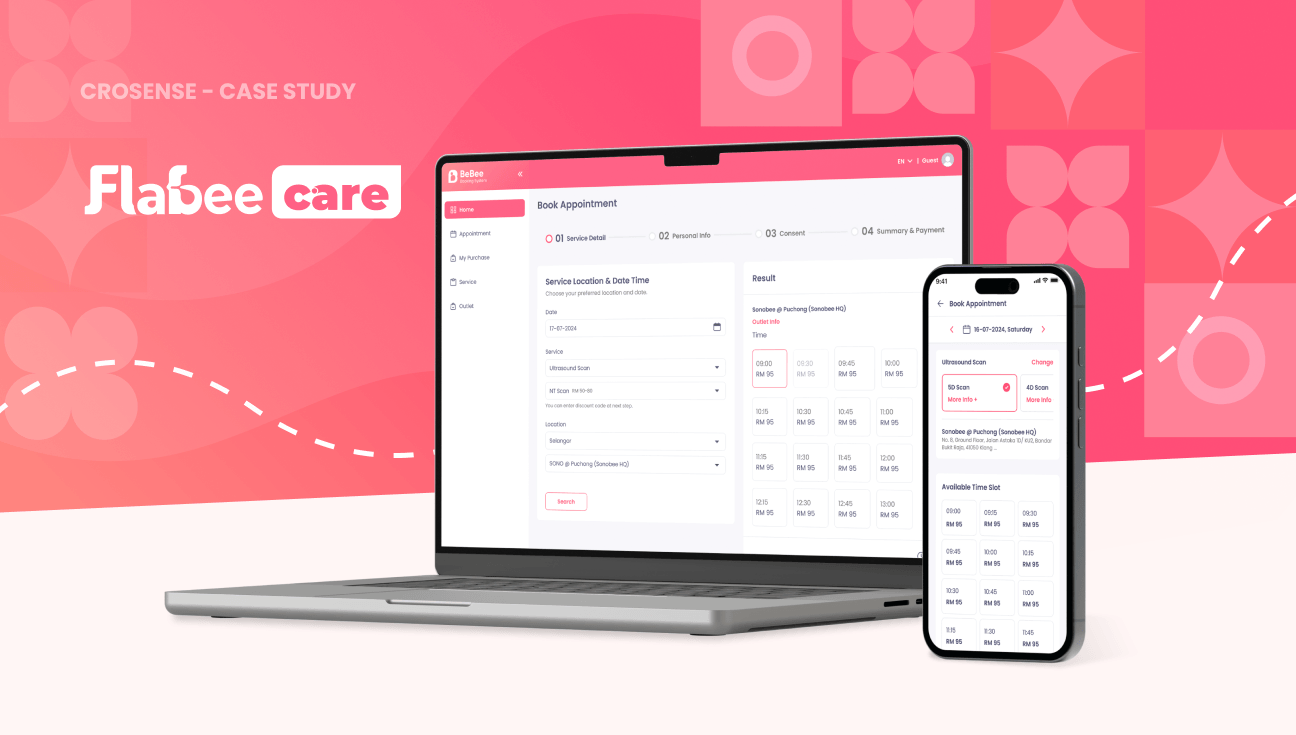
From B2B to B2C: Designing an Empathetic Booking Journey for Flabee
Overview
Bridging Digital Convenience and Physical Care
In this case study, we take you behind the scenes of our design process for Flabee, focusing on a core service: the online booking flow. This project was more than just a visual update; it was about transforming a complex internal tool into a seamless, customer-facing experience that supports parents during their most important milestones.
About Client
Flabee provides a ecosystem for mothers and families, offering products and services from prenatal massages to specialized baby food. While their physical stores are the heart of their service, the FlabeeCare app and website serve as the vital bridge connecting digital convenience with physical care.
The problem
The Barrier of a Staff-Only System
Originally, Flabee’s appointment system was a B2B tool designed exclusively for store staff. This created a significant hurdle: expectant mothers—the end customers—could only book services by calling or visiting a store in person.
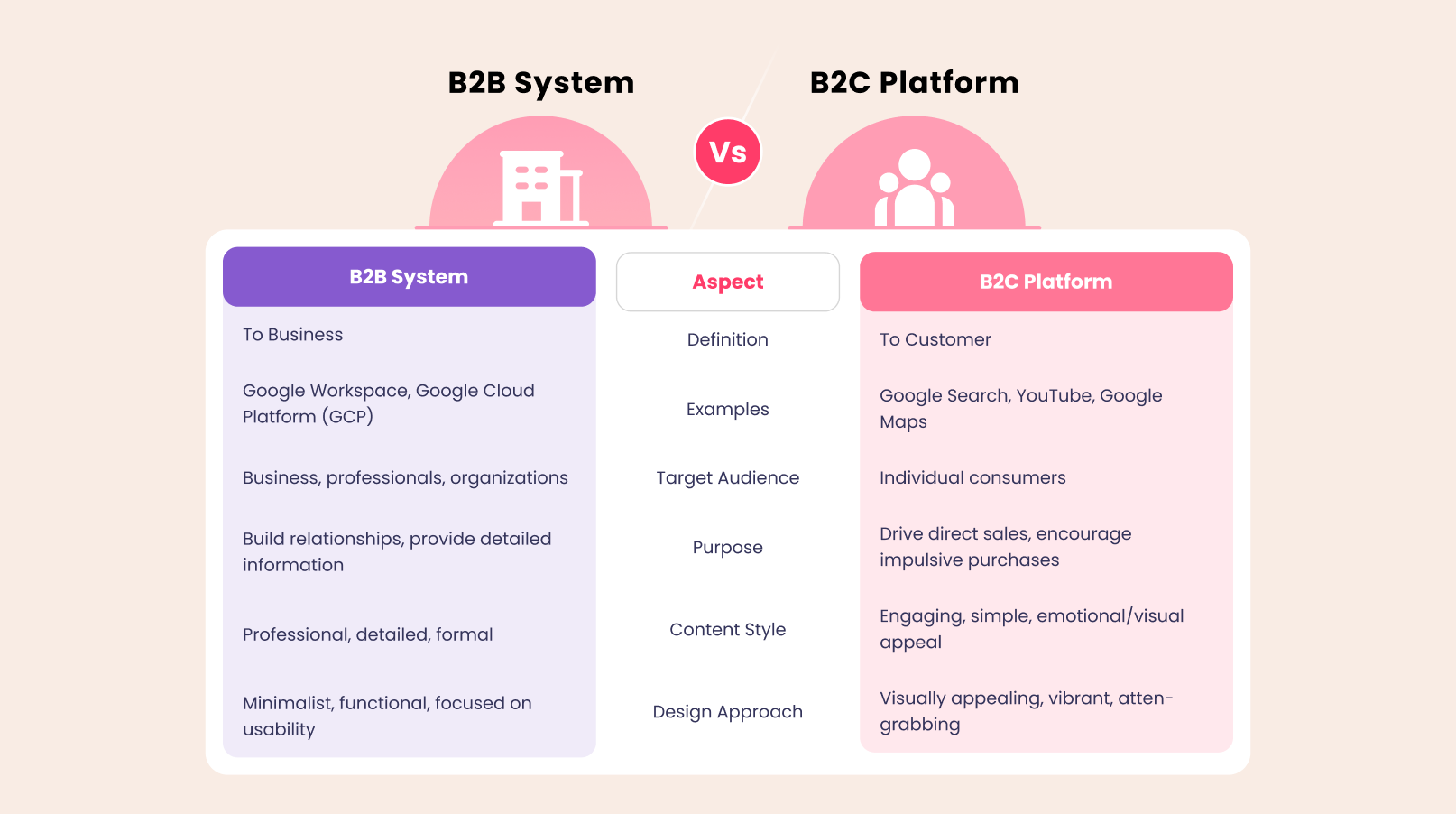
Our task was to lead the B2B-to-B2C transformation, which involved two critical challenges:
1. A Shift in Audience: Transitioning from a "data entry" interface for staff to an "intuitive journey" for consumers that is emotionally engaging and easy to navigate.
2.Balancing Accessibility: We needed to simplify the process for new parents while ensuring the system remained functional for the store staff who manage these bookings daily.
The Solution
A Flexible, User-Centric Flow
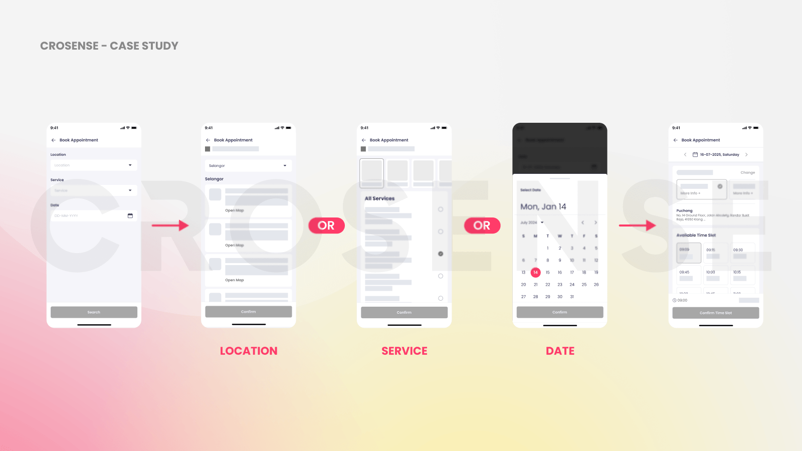
Instead of a rigid, linear form, we introduced a dynamic booking approach. One of the project's most intense discussions involved the team, developers, and stakeholders: What should the user select first—the location, the date, or the service type?
Each stakeholder had a valid perspective, leading to a debate on the most efficient entry point. To resolve this, we looked beyond typical service apps and drew inspiration from airline booking systems. * Context-First Flexibility: Just as a traveler might prioritize a destination or a specific date, a parent’s needs vary. We designed a system where users aren't forced into a fixed sequence. Whether they start with a preferred location or a specific available date, the backend dynamically updates slots and pricing in real-time.
1. Breaking the Deadlock: This "Airlines Logic" provided the perfect middle ground—offering the power of a complex search engine while maintaining the simplicity of a consumer app. It reduced back-and-forth navigation and ensured that users never hit a "no results found" wall after minutes of data entry.
2. Intuitive Hierarchy: We further optimized the UI using the Law of Proximity, grouping related fields to ensure the booking process feels light and manageable, even on mobile screens.
The result
Clarity Through Familiarity
A successful redesign doesn't always mean starting from zero. We chose to retain the stepper navigation from the legacy design. This familiar element acts as an anchor, showing users exactly where they are in the process and reducing "booking anxiety."
By aligning the digital experience with the real-world habits of busy parents, we reduced back-and-forth navigation and created a more standardized, transparent booking process. The result is a system that doesn't just process data—it builds trust from the very first click.