Simplifying Choice: Optimising Maybank’s Online Application Journey
Overview
Simplifying Choices in Corporate Finance
This project focused on optimizing the "Apply Online" experience for Maybank’s digital platform. Our goal was to transform a data-heavy interface into a clean, intuitive journey. By implementing smart navigation and a streamlined information layout, we reduced cognitive load, allowing both new and existing users to discover and apply for financial products with greater confidence.
About the Client: Humanising Financial Services
As the largest bank in Malaysia and a leader in Southeast Asia, Maybank is guided by the mission to "Humanise Financial Services." This commitment means placing the customer at the center of every digital interaction. Maybank entrusted Crossense with optimizing a key gateway of its web portal—ensuring the interface reflects this user-first philosophy while maintaining the high-performance standards required for banking.
The problem
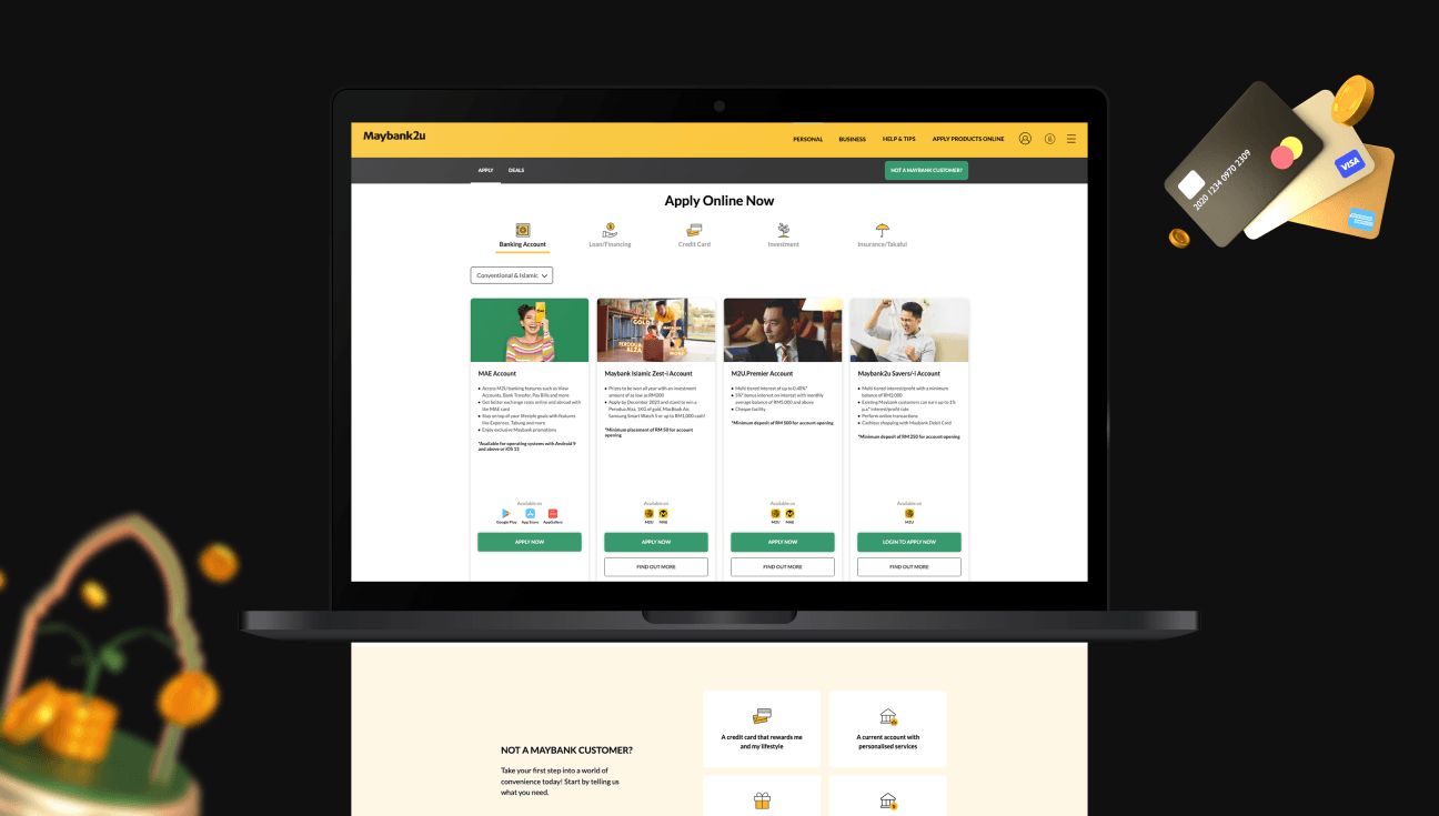
The "Wall of Information"
The original interface presented a significant barrier: Choice Overload. Users were met with an exhaustive, unfiltered list of products without a clear hierarchy.
1. High Interaction Cost: Because the initial view lacked key details, users were forced to click into every single product just to understand its benefits.
2. Navigation Fatigue: For new users, the lack of categorization meant they had to "guess" which products suited their needs, leading to frustration and potential drop-offs.
3. Categorical Confusion: There was no quick way to distinguish between essential banking categories, making the browsing process feel tedious rather than empowering.
The Solution
Precision Filtering & Intuitive Discovery
Our strategy was to replace "searching" with "discovery." We introduced a multi-layered filtering system designed to respect the user's time:
1. Horizontal Category Filters: We implemented a high-level horizontal filter that allows users to toggle between product types instantly. This eliminates the need for deep-dive menus and keeps the user grounded in their current context.
2. Inclusive Banking Options: Recognizing Malaysia’s diverse market, we integrated a dedicated toggle for Islamic vs. Conventional products. This ensures that users can align their financial choices with their values in a single click.
3. Guided Entry for New Users: For those unfamiliar with Maybank’s ecosystem, we added a Strategic Segment Filter. By selecting from three core intent categories, the system "recommends" the most suitable plans. This shifts the burden of choice from the user to the system, providing a guided path to the right decision.
The result
Clarity Over Complexity
The redesigned portal bridges the gap between complex banking structures and everyday usability. By applying the Law of Proximity—grouping related benefits with their respective products—we eliminated the need for back-and-forth navigation.
The final result is a frictionless browsing experience where relevant information surfaces exactly when needed. This transformation doesn't just improve aesthetics; it upholds Maybank’s commitment to making financial services accessible, straightforward, and truly "human."